 |
| Best Look |
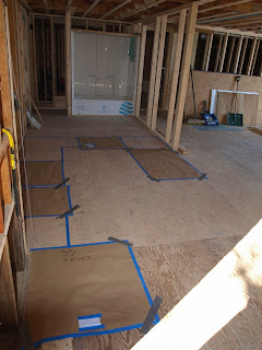
I think the two photos directly above give you the best depiction of the kitchen. So you can see the fridge in the front of the photo, against the wall you'll see the dishwasher and sink. A section of drawers will be between the fridge and the dishwasher and a corner cabinet will be in the far corner. In the middle of the wall that borders the bathroom you'll see the oven and to the right of the oven we are hoping for another corner cabinet and a breakfast bar. The wall to the right of the bar will come down to enable seating for three. As soon as I get the professional rendering I'll post it here.
Peace!


No comments:
Post a Comment